Your lines should look intentional — not crunchy
Resizing and compression eat edge contrast. The answer isn’t “more sharpening” — it’s the right pass. Use an image sharpener that respects style and avoids halos.
A creator’s checklist
- Finish at 1.5–2× target and downscale smart (Lanczos/Bicubic).
- Preview at 100%; judge at output size, not zoomed.
- Treat line art more gently than textured fills.
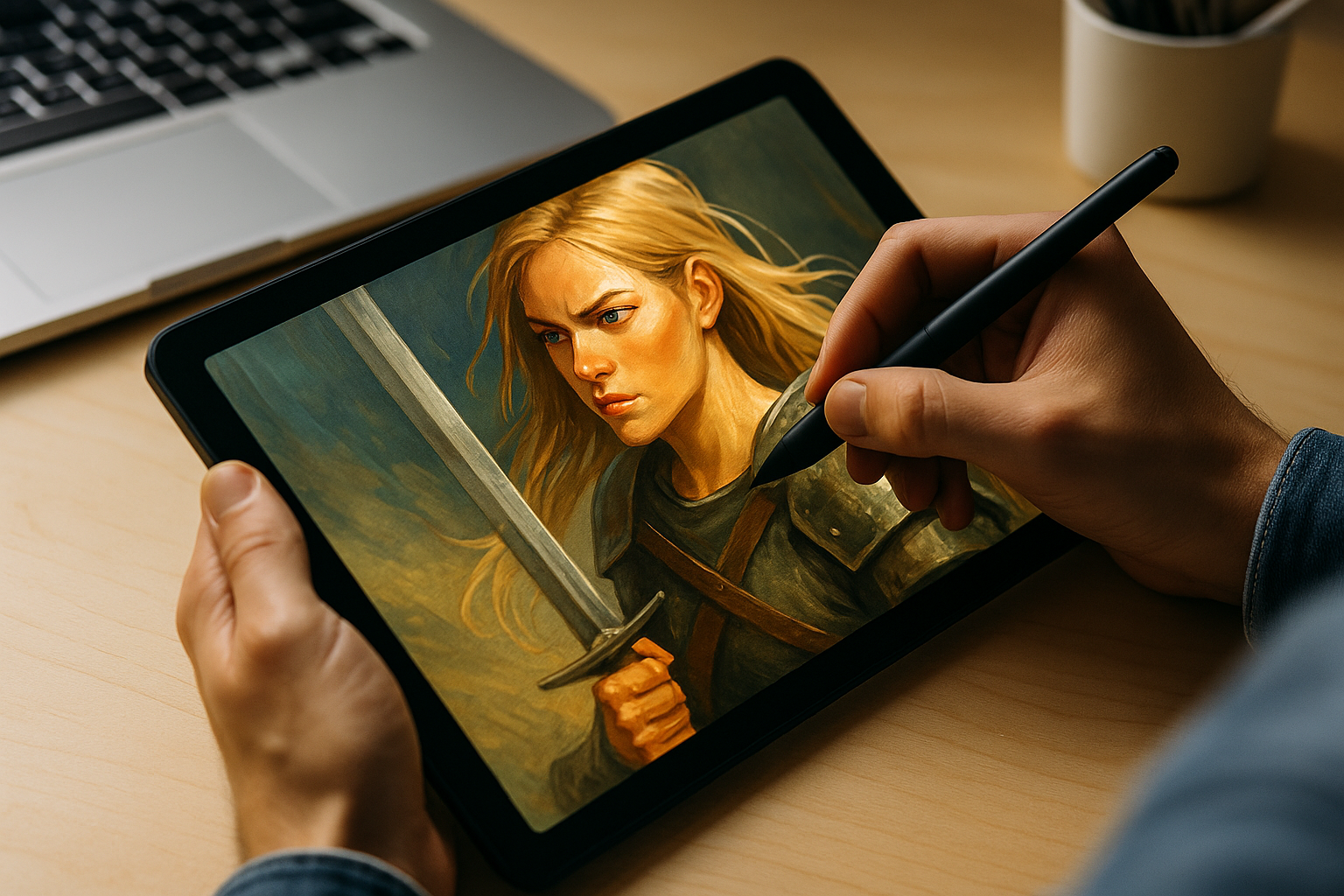
Use Imgsharer’s Illustration preset
- Edge-aware de-blur: deconvolution only where true edges exist.
- Micro-contrast: restores brush texture without plastic skin.
- Halo guard: thresholding that blocks bright rings around ink.
Want to experiment live? Try the optional image sharpener AR preview: hold your phone over a print or screen and see the sharpened look while you frame. And if you ever need to fix a blurry photo of your merch or prints, the product workflow helps too.
Settings that usually win
- Radius: 0.4–0.8 px for web exports; smaller canvases need smaller radii.
- Amount: Medium first; raise only if your lines were truly soft.
- Threshold: 2–6 to protect gradients and skin tones in character art.
Make web posts crisp and prints intentional. With Imgsharer and its AI Image Sharpener, you can fix a blurry photo of your artwork or rescue a soft export in minutes.